
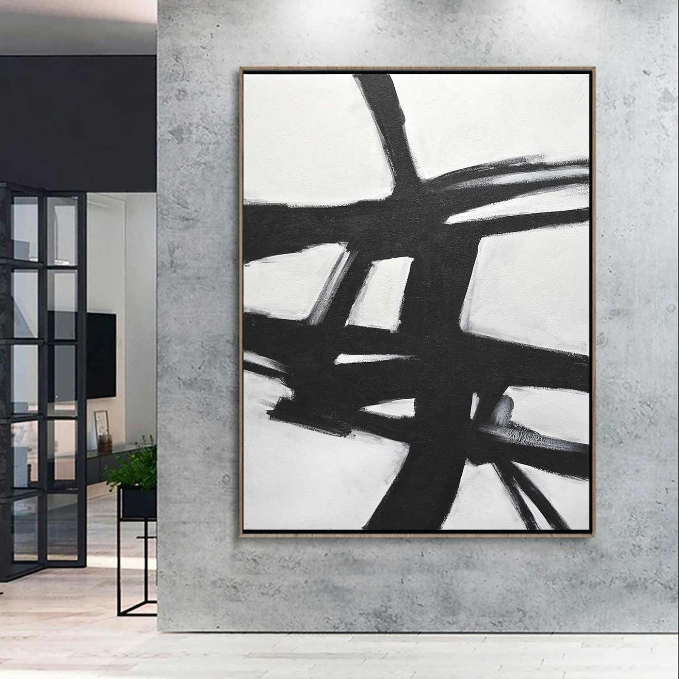
Black and White Abstract Art: The Power of Simplicity
Black and white abstract art proves that a limited palette can create a world of expression. Without color to set the mood, artists rely on shape, line, texture, contrast, and composition to draw the viewer in. The result can feel bold or quiet, orderly or unpredictable—and often invites each person to see something different.
Why Black and White?
Black and white create one of the strongest contrasts in visual art. A crisp black line against a white field can command attention, while softer shades of gray can add subtlety and depth. This reduced palette removes the distraction of color and focuses attention on the artwork’s structure and movement.
That simplicity does not make the art less expressive. Instead, it gives artists room to explore how visual elements interact. A dense cluster of marks may feel energetic or tense; a broad, empty space may suggest calm, distance, or possibility.
Shape, Line, and Texture
In abstract art, forms do not have to represent recognizable objects. Geometric shapes can create a sense of balance or precision, while irregular forms may feel spontaneous and organic. Repeated lines can establish rhythm, and a sudden break in that pattern can create emphasis.
Texture adds another layer of interest. Artists may use rough brushstrokes, layered ink, torn paper, or smooth blocks of color. Even in a monochrome composition, these differences can make one area seem to move forward while another recedes. In a digital image, carefully varied marks and tonal values can create a similar effect.
Balance and Contrast
Contrast is central to black and white abstract art, but contrast does not always mean placing equal amounts of pure black and bright white side by side. An artist might use a small dark shape to anchor a mostly light composition, or spread dark forms across the canvas to create visual weight. Gray tones can soften the transitions and connect opposing areas.
Composition matters just as much. Symmetry may give a work a stable, measured feeling. An asymmetrical arrangement can feel more active, especially when shapes and lines pull the eye in different directions. Empty space also plays an important role: what is left unmarked can be as meaningful as what is drawn or painted.
A Personal Viewing Experience
Abstract art rarely comes with one required interpretation. One viewer might see a city map in a web of lines, while another notices a landscape, a musical rhythm, or simply the relationship between marks and space. These responses can change over time and from one viewing to the next.
To spend time with a black and white abstract work, begin by noticing what catches your eye. Follow the lines, compare the textures, and observe where the darkest and lightest areas appear. Consider whether the composition feels balanced, restless, open, or crowded. There is no need to identify a specific subject; curiosity is enough.
Bringing Monochrome Art Into a Space
Black and white abstract art can complement many interior styles, from minimalist rooms to spaces filled with color and pattern. A large, high-contrast piece can become a focal point, while a smaller work may add a quiet note of texture. Pairing several pieces can create a visual rhythm, especially when their shapes or marks share a common quality.
Because the palette is restrained, details such as scale, framing, and placement have a strong effect. A simple frame can emphasize clean lines, while an unframed canvas may make a piece feel more informal. Good lighting can reveal the texture of the surface and the subtle differences between black, white, and gray.
Endless Possibilities
Black and white abstract art is not defined by a single style or mood. It can be precise or expressive, minimal or richly layered, carefully planned or spontaneous. By working with a limited palette, artists reveal how much emotion and visual variety can come from contrast, form, and space alone.
Whether viewed in a gallery, at home, or on a screen, these works reward close attention. Their simplicity is an invitation to look longer—and to discover how much can happen between black and white.
9 Reasons to Embrace Black and White Abstract Art in Your Space
- Creates striking visual contrast.
- Works well with many decor styles.
- Emphasizes shape, line, and texture.
- Adds a timeless look to a room.
- Makes a bold focal point.
- Pairs easily with colorful accents.
- Encourages personal interpretation.
- Can make a space feel calm or dramatic.
- Offers visual impact with a simple palette.
Challenges of Black and White Abstract Art: Navigating Limited Color, Interpretation Difficulties, Harsh Contrasts, and Repetitiveness
- Limited color may feel less vibrant.
- Abstract forms can be hard to interpret.
- High contrast may feel visually harsh.
- Some pieces may seem repetitive.
Creates striking visual contrast.
Black and white abstract art creates striking visual contrast by placing light and dark forms side by side. This bold interplay draws the eye, emphasizes shapes and textures, and gives the composition a strong sense of depth and movement. Even simple lines or forms can feel dramatic and memorable when set against a contrasting background.
Works well with many decor styles.
Black and white abstract art works well with many decor styles because its neutral palette complements a wide range of colors, materials, and furnishings. It can add a bold focal point to a minimalist room, bring a modern touch to traditional decor, or balance a space filled with vivid colors and patterns. Its versatility also makes it easy to update a room without needing to replace the artwork.
Emphasizes shape, line, and texture.
One of the key strengths of black and white abstract art is its ability to emphasize shape, line, and texture. Without color competing for attention, viewers can focus on how forms interact, how lines guide the eye, and how marks or materials create surface detail. Strong contrasts can make shapes feel more defined, while subtle shifts between black, white, and gray reveal texture and depth.
Adds a timeless look to a room.
Black and white abstract art adds a timeless look to a room because its classic palette complements a wide range of decorating styles. Whether paired with modern furniture, vintage details, or colorful accents, its contrast and simple tones feel polished without seeming tied to a passing trend. The result is artwork that can continue to suit a space even as its décor changes.
Makes a bold focal point.
Black and white abstract art can make a bold focal point in any room. Its strong contrast naturally draws the eye, while expressive shapes, lines, and textures add visual interest without relying on color. A striking piece can anchor a space, complement a range of décor styles, and give the room a distinctive sense of energy and character.
Pairs easily with colorful accents.
Black and white abstract art pairs easily with colorful accents because its neutral palette complements rather than competes with other hues. A vivid cushion, bright vase, or bold wall color can stand out alongside the artwork, while the art’s strong shapes and contrast help keep the overall look balanced. This versatility makes it simple to refresh a room by changing its accent colors without needing to replace the art.
Encourages personal interpretation.
Black and white abstract art encourages personal interpretation because it doesn’t rely on familiar colors or recognizable subjects to tell viewers what to see. Instead, its shapes, lines, contrasts, and textures leave room for individual associations and emotions. One person might find a composition calm and balanced, while another sees movement or tension. This openness makes each viewing experience personal—and can lead to new interpretations over time.
Can make a space feel calm or dramatic.
Black and white abstract art can shift the mood of a space with just a few visual elements. Soft contrasts, open areas, and gentle shapes can create a calm, balanced feeling, while bold black forms, sharp lines, and strong contrast can bring energy and drama. This versatility makes monochrome art an easy way to shape a room’s atmosphere without relying on color.
Offers visual impact with a simple palette.
Black and white abstract art can make a strong visual impact without relying on a broad range of colors. The sharp contrast between light and dark draws the eye to shapes, lines, and textures, while the simple palette keeps the composition clear and focused. This balance allows even a few bold marks to feel striking and memorable.
Limited color may feel less vibrant.
One potential drawback of black and white abstract art is that its limited palette may feel less vibrant than artwork rich in color. Without bright hues to create warmth, energy, or a specific mood, some pieces may seem restrained or subdued, especially to viewers who enjoy bold, colorful designs. Still, contrast, texture, and composition can add visual impact, even when the palette is monochrome.
Abstract forms can be hard to interpret.
One drawback of black and white abstract art is that its forms can be hard to interpret. Without recognizable subjects or color cues, viewers may be unsure what they are looking at or what the artist intended to express. This ambiguity can make the artwork feel intriguing to some people, but confusing or emotionally distant to others.
High contrast may feel visually harsh.
One drawback of black and white abstract art is that its strong contrast can feel visually harsh. Bold black shapes against bright white backgrounds may create a sense of intensity or tension, which can be tiring for some viewers, especially in a small room or a space meant to feel calm. Choosing a piece with softer gray tones, gentler transitions, or more open space can help create a more balanced effect.
Some pieces may seem repetitive.
One drawback of black and white abstract art is that some pieces may seem repetitive, especially when they rely on similar shapes, sharp contrasts, or familiar patterns. Without color to distinguish one work from another, compositions can feel alike at first glance. Looking more closely may reveal differences in texture, spacing, rhythm, and technique, but viewers who prefer greater variety may find the style less engaging.