
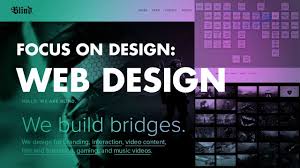
Graphic Design Sites: Unleashing Your Creativity Online
In today’s digital age, graphic design has become an integral part of our lives. From branding and advertising to web design and social media content, the demand for visually appealing and engaging designs is on the rise. Whether you’re a professional graphic designer or someone who wants to explore their creative side, there are countless online platforms that can help you unleash your creativity and take your design skills to new heights. In this article, we will explore some of the top graphic design sites that offer a plethora of resources, tools, and inspiration.
- Canva: Canva is a user-friendly platform that enables users to create stunning designs without any prior design experience. With its drag-and-drop interface and an extensive library of templates, images, fonts, and graphics, Canva empowers individuals to craft professional-looking designs for various purposes.
- Behance: Behance is a leading online platform for showcasing and discovering creative work. Graphic designers can create a portfolio to showcase their projects, connect with other professionals in the industry, and gain exposure by sharing their work with a global audience.
- Dribbble: Dribbble is a community-driven platform where designers share their works-in-progress or completed projects. It serves as an excellent source of inspiration for graphic designers looking to stay updated with the latest trends and discover new techniques.
- Adobe Creative Cloud: Adobe Creative Cloud offers a comprehensive suite of tools for graphic designers, including Photoshop, Illustrator, InDesign, and more. With its powerful features and extensive capabilities, Adobe Creative Cloud remains the go-to choice for many professionals in the industry.
- Pinterest: While not exclusively dedicated to graphic design, Pinterest serves as a treasure trove of visual inspiration across various categories. Graphic designers can create mood boards, gather ideas from other creatives’ pins, and find endless sources of inspiration for their own projects.
- 99designs: 99designs is a platform that connects businesses with talented graphic designers. Clients can launch design contests, and designers can submit their work to compete for the project. It’s an excellent opportunity for designers to showcase their skills and potentially land new clients.
- Designspiration: Designspiration is a curated gallery of designs from various creative disciplines, including graphic design, typography, photography, and more. It offers an endless stream of visually stunning work to inspire and spark creativity.
- Creative Market: Creative Market is a marketplace where designers can buy and sell various design assets, including fonts, templates, graphics, and more. It’s a valuable resource for finding unique design elements to enhance your projects.
These are just a few examples of the many graphic design sites available online. Each platform offers its own unique features and benefits, catering to different needs and preferences. Whether you’re seeking inspiration, looking for tools to enhance your designs, or searching for opportunities to connect with other professionals in the industry, these sites provide a wealth of resources to help you elevate your graphic design skills.
Remember, the key to unlocking your creative potential lies in practice and exploration. So dive into these graphic design sites today and let your imagination soar!
6 Essential Tips for Creating Effective Graphic Design Sites
- Keep your design simple and clean – less is more!
- Use high-quality images that are relevant to your content.
- Make sure all text is readable and clear, with an appropriate font size and weight.
- Create a consistent visual language throughout the site by using the same color palette, typeface, etc.
- Incorporate interactive elements such as animations or videos to enhance user experience and engagement.
- Test the site on various devices to ensure it looks good across different screen sizes and resolutions.
Keep your design simple and clean – less is more!
When it comes to graphic design, the age-old adage “less is more” holds true. In a world filled with visual noise, simplicity and cleanliness can make your designs stand out from the clutter and capture attention. Whether you’re designing a logo, a website layout, or a social media graphic, embracing simplicity can have a powerful impact on your overall design aesthetic.
One of the key benefits of keeping your design simple is its ability to convey a clear message. By eliminating unnecessary elements and distractions, you allow the core message or concept to shine through. A clean design ensures that viewers can easily grasp the intended meaning without confusion or overwhelm.
Another advantage of simplicity in design is its versatility. A minimalistic approach allows for greater flexibility in adapting your designs across different mediums and platforms. Whether it’s being displayed on a large billboard or a tiny mobile screen, a clean and simple design will remain impactful and easily recognizable.
Moreover, simplicity enhances user experience. By decluttering your design and focusing on essential elements, you create an intuitive and user-friendly interface. Visitors to your website or users of your app will appreciate the ease of navigation and find it easier to engage with your content.
In addition to aesthetics and functionality, simplicity also contributes to faster loading times. Uncomplicated designs with fewer elements require less bandwidth and processing power, resulting in quicker loading speeds. This not only improves user experience but also boosts search engine optimization (SEO) as search engines prioritize fast-loading websites.
When implementing simplicity in your designs, consider using ample white space or negative space strategically. White space helps create visual breathing room and allows important elements to stand out effectively. It also lends an air of elegance and sophistication to your overall composition.
Remember that simplicity doesn’t equate to dullness or lack of creativity. On the contrary, it requires thoughtful decision-making in choosing the right colors, typography, and layout. Each element should have a purpose and contribute to the overall harmony of the design.
In conclusion, keeping your design simple and clean is a powerful principle in graphic design. It ensures clarity, versatility, user-friendliness, faster loading times, and an overall visually appealing aesthetic. Embrace simplicity and let your designs make a bold statement in a world full of noise.
Use high-quality images that are relevant to your content.
Use High-Quality Images That Are Relevant to Your Content: Enhancing Your Graphic Design
When it comes to graphic design, visuals play a crucial role in capturing the attention of your audience and conveying your message effectively. One essential tip to elevate your designs is to use high-quality images that are relevant to your content. In this article, we will explore why this tip is important and how it can enhance your graphic design projects.
Firstly, using high-quality images adds a level of professionalism and credibility to your designs. Blurry or pixelated images can give the impression of carelessness and may undermine the overall impact of your work. By investing in high-resolution images, you ensure that every detail is crisp and clear, making your designs visually appealing and engaging.
Secondly, relevance is key when selecting images for your graphic design projects. The images you choose should align with the message you want to convey or the story you want to tell. For example, if you’re designing a brochure for a travel agency, using vibrant and captivating images of picturesque destinations will evoke wanderlust in viewers and encourage them to explore further.
Relevant images also help create a cohesive visual narrative throughout your design. When all elements work together harmoniously, it enhances the overall aesthetic appeal and ensures that viewers can easily grasp the intended message or concept.
Additionally, using high-quality and relevant images can help establish an emotional connection with your audience. Humans are highly visual beings, and we often respond emotionally to what we see. By selecting images that evoke specific emotions or resonate with your target audience’s interests or aspirations, you can create a deeper connection with them.
To find high-quality images that are relevant to your content, there are several options available. Stock photo websites like Shutterstock or Unsplash offer a vast collection of professional-grade photos covering various topics. These platforms allow you to search for specific keywords related to your project, making it easier to find suitable visuals.
Another option is to consider creating your own images or collaborating with photographers or illustrators. This approach ensures that your designs have a unique and personalized touch, tailored specifically to your content.
In conclusion, using high-quality images that are relevant to your content is a valuable tip for enhancing your graphic design projects. It adds professionalism, improves the overall visual appeal, and helps establish an emotional connection with your audience. So, take the time to select visually stunning and contextually appropriate images – it can make a significant difference in the success of your designs.
Make sure all text is readable and clear, with an appropriate font size and weight.
When it comes to graphic design, one crucial aspect that often gets overlooked is the readability of text. No matter how visually stunning a design may be, if the text is difficult to read or understand, its effectiveness diminishes. That’s why it’s essential to ensure that all text in your designs is readable and clear, with an appropriate font size and weight.
Choosing the right font size is crucial for readability. If the text is too small, it can strain the reader’s eyes and make it challenging to comprehend the message. On the other hand, if the font size is too large, it can overwhelm the design and disrupt the overall balance. Finding a balance where the text is legible without overpowering other elements of your design is key.
Additionally, selecting an appropriate font weight can greatly impact readability. Different fonts have varying weights, such as light, regular, bold, or even extra bold. Consider the purpose of your design and choose a font weight that complements it. For example, if you’re designing a bold headline or title, using a heavier font weight can make it stand out. On the other hand, for longer paragraphs of body text, opting for a lighter weight can improve readability.
Furthermore, consider contrast when designing your typography. Ensure that there is enough contrast between the text color and background color to make reading effortless. A high contrast ratio enhances legibility and ensures that even individuals with visual impairments can access your content.
Lastly, don’t forget about hierarchy in your typography. Establishing a clear visual hierarchy helps guide readers through your design by emphasizing important information and organizing content effectively. Use different font sizes or styles to distinguish headings from body text or highlight key points within paragraphs.
In summary, paying attention to readability in graphic design is essential for effective communication. Make sure all text in your designs is easily readable and clear by choosing appropriate font sizes and weights. Consider contrast and hierarchy to enhance legibility and guide the viewer’s attention. By prioritizing readability, you can create designs that not only look visually appealing but also effectively convey your message to your audience.
Create a consistent visual language throughout the site by using the same color palette, typeface, etc.
Creating a Consistent Visual Language on Graphic Design Sites
One of the most crucial aspects of graphic design is creating a cohesive and visually appealing experience for users. When designing a website, it is essential to establish a consistent visual language throughout the site. This can be achieved by utilizing the same color palette, typeface, and other design elements.
By using a consistent color palette, you can create a harmonious and unified look across your website. Choose colors that reflect your brand’s identity and evoke the desired emotions. Stick to a limited number of colors to avoid overwhelming the user and maintain visual consistency.
Similarly, selecting a consistent typeface or font family helps establish a clear hierarchy and enhances readability. Choose fonts that align with your brand’s personality while ensuring they are legible across different devices and screen sizes.
In addition to color and typography, other design elements such as icons, buttons, and imagery should also follow a consistent style. Use similar shapes, styles, and visual treatments to create cohesiveness throughout your site.
Why is creating a consistent visual language important? Firstly, it helps users navigate your site more easily. When design elements remain consistent from page to page, visitors can quickly identify different sections or areas of interest. This improves user experience by reducing confusion and making information more accessible.
Secondly, consistency in design builds trust with your audience. A visually cohesive website conveys professionalism and attention to detail. Users are more likely to perceive your brand as reliable when they encounter an aesthetically pleasing and well-organized site.
Lastly, establishing a consistent visual language strengthens brand recognition. When users encounter familiar colors, typography, or design elements on your website, they will associate them with your brand identity. This consistency extends beyond the website itself and can carry over into other marketing materials or platforms.
To achieve consistency in web design:
- Define your brand guidelines: Establish clear guidelines for color palette selection, typography usage (including font sizes, weights, and styles), and other design elements.
- Create a style guide: Develop a comprehensive style guide that outlines how different design elements should be used throughout the site. This guide serves as a reference for designers and developers to maintain consistency.
- Regularly review and update: As your website evolves or new design trends emerge, periodically review and update your visual language to ensure it remains relevant and aligned with your brand’s identity.
In conclusion, creating a consistent visual language on graphic design sites is essential for enhancing user experience, building trust, and strengthening brand recognition. By utilizing the same color palette, typeface, and other design elements throughout your site, you can create a cohesive and visually appealing experience that leaves a lasting impression on your audience.
Incorporate interactive elements such as animations or videos to enhance user experience and engagement.
Enhancing User Experience and Engagement: The Power of Interactive Elements in Graphic Design Sites
In the ever-evolving world of graphic design, one tip stands out as a game-changer: incorporating interactive elements such as animations or videos. These dynamic features have the power to elevate user experience and engagement on graphic design sites, capturing attention and leaving a lasting impact on visitors.
Interactive elements breathe life into static designs, adding a layer of interactivity that captivates users and encourages them to explore further. By integrating animations or videos strategically, designers can create immersive experiences that resonate with their audience.
One of the key benefits of incorporating interactive elements is enhanced user experience. Animations can guide users through a website or highlight important information in an engaging way. They can be used to provide visual cues, showcase product features, or tell stories that draw users in. Videos, on the other hand, offer an opportunity to convey complex concepts or demonstrate processes effectively. They can be used for tutorials, product demos, or even background videos that set the mood and tone of a website.
Moreover, interactive elements foster increased engagement from users. When visitors encounter something unique and captivating on a graphic design site, they are more likely to stay longer and explore further. Animations or videos can create memorable moments that leave a lasting impression on users’ minds. This increased engagement not only enhances the overall user experience but also contributes to higher conversion rates and improved brand perception.
However, it’s important to strike a balance when incorporating interactive elements. Too many animations or videos can overwhelm users and hinder their browsing experience. It’s crucial to use them purposefully and ensure they align with the overall design aesthetic and message of the site.
As technology continues to advance, designers have access to an array of tools and resources for creating interactive elements easily. From CSS animations to HTML5 video integration, there are numerous options available that cater to different skill levels.
In conclusion, incorporating interactive elements such as animations or videos can significantly enhance user experience and engagement on graphic design sites. By leveraging these dynamic features strategically, designers can create captivating experiences that leave a lasting impact on visitors. So, embrace the power of interactivity and watch your designs come to life in ways that delight and engage users like never before.
Test the site on various devices to ensure it looks good across different screen sizes and resolutions.
Designing for a diverse digital landscape: Testing your graphic design site on various devices
In today’s mobile-first world, it’s crucial for graphic designers to create designs that look good and perform well across different screen sizes and resolutions. With the wide range of devices available, from smartphones and tablets to laptops and desktop computers, users access websites through various platforms. To ensure a seamless user experience, it is essential to test your graphic design site on multiple devices.
Testing your site on different devices allows you to identify any potential issues with the layout, responsiveness, or overall visual appeal. Here are a few reasons why testing on various devices is crucial:
Consistency: Each device has its own screen size and resolution, which can impact how your design elements are displayed. By testing your site on different devices, you can ensure that your design maintains consistency across all platforms. Elements like fonts, images, and buttons should be proportionate and easily readable regardless of the device used.
Responsiveness: Responsive design is key in today’s mobile-driven world. Users expect websites to adapt seamlessly to their device screens without sacrificing functionality or aesthetics. Testing on multiple devices allows you to confirm that your design responds properly to different screen sizes and orientations.
User Experience: User experience plays a vital role in the success of any website. By testing your graphic design site on various devices, you can evaluate how users interact with your content across different platforms. This helps identify any usability issues or navigation challenges that may arise due to varying screen sizes.
Performance: Different devices have varying processing power and internet connectivity speeds. Testing your site on multiple devices allows you to assess its performance under different conditions. This helps optimize loading times and ensures a smooth browsing experience for all users.
To effectively test your graphic design site across different devices:
Start by identifying the most commonly used devices among your target audience.
Test your site using physical devices or utilize online tools that simulate different screen sizes and resolutions.
Pay attention to how your design elements adapt and adjust on each device, ensuring they remain visually appealing and functional.
Test various features, such as forms, buttons, and menus, to ensure they work seamlessly on all devices.
Consider user feedback and make necessary adjustments to improve the overall user experience.
Remember, testing your graphic design site on multiple devices is an ongoing process. As technology evolves and new devices emerge, it’s crucial to stay updated and adapt your designs accordingly. By embracing this practice, you can create a visually stunning and user-friendly experience for all visitors, regardless of the device they use to access your site.