
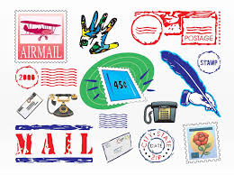
Graphic Communication: The Power of Visual Language
In today’s fast-paced and visually-oriented world, effective communication is crucial. Words alone are often not enough to convey complex ideas or capture attention in a crowded marketplace. That’s where graphic communication comes into play – the art of using visuals to convey messages, evoke emotions, and engage audiences.
Graphic communication encompasses a wide range of mediums, including graphic design, illustration, typography, photography, and motion graphics. It combines elements such as color, shape, imagery, and composition to create visually compelling pieces that communicate ideas with impact.
One of the key strengths of graphic communication is its ability to transcend language barriers. Visuals have a universal language that can be understood by people from different cultures and backgrounds. Whether it’s through symbols, icons, or infographics, graphic communication has the power to deliver information quickly and efficiently.
Moreover, visuals have a profound impact on human psychology. Studies have shown that our brains process visual information faster than text. We are naturally drawn to images and respond emotionally to what we see. By leveraging this innate human response, graphic communication can effectively capture attention and leave a lasting impression.
In the business world, graphic communication plays a vital role in branding and marketing strategies. A well-designed logo instantly conveys the essence of a company or product. Eye-catching advertisements grab our attention amidst a sea of distractions. Thoughtfully crafted packaging influences our purchasing decisions.
Beyond commerce, graphic communication also plays a significant role in education and public awareness campaigns. Infographics simplify complex data into easily digestible visual representations. Posters raise awareness about social issues and inspire action. Instructional illustrations guide us through complicated processes step-by-step.
With the rise of digital media and social platforms, graphic communication has become even more prevalent in our daily lives. Social media feeds are filled with striking visuals that tell stories at a glance. Websites employ intuitive user interfaces with appealing designs to enhance user experience.
However, graphic communication is not just about aesthetics. It requires a deep understanding of the target audience, the message to be conveyed, and the context in which it will be presented. Graphic designers and visual communicators must possess a keen eye for detail, strong conceptual thinking skills, and a mastery of design principles.
In conclusion, graphic communication is a powerful tool that harnesses the visual language to convey messages effectively. It bridges gaps between cultures, captures attention in a crowded world, and influences our emotions and actions. From branding to education to social awareness, graphic communication plays an integral role in shaping our perceptions and understanding of the world around us. So next time you encounter an impactful visual piece, take a moment to appreciate the artistry and thought behind it – for graphic communication truly is a language that speaks volumes.
9 Essential Tips for Effective Graphic Communication
- Keep it simple
- Use appropriate colors
- Consistency is key
- Balance elements
- Prioritize readability
- Incorporate white space
- Use visuals strategically
- Consider accessibility
- Test before finalizing
Keep it simple
When it comes to graphic communication, one of the most important tips to keep in mind is to keep it simple. In a world filled with information overload and constant distractions, simplicity is key to capturing attention and conveying your message effectively.
A cluttered design can overwhelm the viewer and dilute the impact of your communication. By simplifying your visuals, you allow the audience to focus on the key elements and understand the message more easily. A clean and uncluttered design creates a sense of clarity, making it easier for viewers to absorb information at a glance.
Simplicity doesn’t mean sacrificing creativity or visual appeal. It means stripping away unnecessary elements and focusing on what truly matters. Use a limited color palette that complements your message and creates visual harmony. Choose fonts that are easy to read and convey the right tone. Embrace white space, as it helps guide the viewer’s eye and gives your design room to breathe.
Another aspect of simplicity is keeping your message concise. Avoid using excessive text or complicated language that may confuse or overwhelm the viewer. Instead, aim for clear and concise messaging that gets straight to the point.
Remember, simplicity is not about dumbing down your content; it’s about distilling it into its most essential form. Think about what information is absolutely necessary for your audience to know or understand, and focus on conveying that effectively.
By keeping it simple in graphic communication, you create designs that are visually appealing, easy to understand, and memorable. Your message will have a greater impact when presented in a clean and straightforward manner. So next time you’re working on a graphic project, remember this tip: less is often more when it comes to effective graphic communication.
Use appropriate colors
Use Appropriate Colors: Enhancing the Impact of Graphic Communication
Colors have a profound impact on how we perceive and interpret visual information. In the realm of graphic communication, choosing appropriate colors is essential to effectively convey messages, evoke emotions, and create a memorable experience for the audience.
The psychology of color plays a crucial role in graphic design. Different colors have distinct meanings and associations that can influence our perception and response. For example, warm colors like red and orange tend to evoke feelings of excitement, passion, and energy, while cool colors like blue and green are often associated with calmness, trust, and harmony.
When selecting colors for your graphic communication projects, it’s important to consider the context and purpose of your message. If you’re designing a logo or brand identity, you’ll want to choose colors that align with the personality and values of the brand. For instance, a health-related brand may opt for soothing blues or fresh greens to convey a sense of well-being.
Contrast is another crucial aspect when working with colors. High contrast between elements can make your design more visually appealing and help important information stand out. However, be mindful not to use too many contrasting colors that may lead to visual overload or distract from the main message.
Color harmony is also key in creating aesthetically pleasing visuals. Using complementary colors (those opposite each other on the color wheel) can create a vibrant and dynamic composition. Analogous colors (those adjacent on the color wheel) offer a more harmonious and unified look.
Consider your target audience when selecting colors as well. Certain cultures or demographics may have different color associations or preferences. Researching cultural meanings associated with specific colors can help you avoid unintentional misinterpretations or offense.
Lastly, accessibility is an important consideration in graphic communication. Ensure that your color choices provide sufficient contrast for individuals with visual impairments or color blindness. Utilize online tools that simulate different types of color vision deficiencies to test the legibility and clarity of your design.
In conclusion, using appropriate colors is a critical aspect of effective graphic communication. Colors have the power to evoke emotions, convey messages, and create a visually captivating experience. By understanding the psychology of color, considering contrast and harmony, and being mindful of cultural associations and accessibility, you can elevate the impact of your designs and effectively connect with your audience. So next time you embark on a graphic communication project, remember that choosing the right colors can make all the difference in delivering a powerful visual message.
Consistency is key
Consistency is Key: The Secret to Effective Graphic Communication
When it comes to graphic communication, consistency is a fundamental principle that cannot be overlooked. Whether you’re designing a logo, creating marketing materials, or developing a website, maintaining consistency throughout your visual elements is key to conveying your message effectively and building a strong brand identity.
Consistency in graphic communication refers to the uniformity and coherence of design elements such as colors, fonts, imagery, and layout. It ensures that all visual components work together harmoniously, creating a cohesive and professional look. Here’s why consistency is so important:
Brand Recognition: Consistency helps establish a recognizable brand identity. When your audience sees consistent visuals across different platforms and touchpoints, they begin to associate those visuals with your brand. This builds trust and familiarity over time.
Professionalism: Consistent design elements demonstrate professionalism and attention to detail. It shows that you have invested time and effort into crafting a cohesive visual identity for your brand or project.
Clear Message: Consistency in graphic communication helps convey your message clearly. By using consistent colors, fonts, and imagery, you create a visual language that reinforces the intended meaning of your content.
User Experience: Consistent design improves user experience by providing familiarity and ease of navigation. When users encounter consistent visuals across different pages or sections of a website, for example, they can quickly understand how to interact with the content.
Visual Hierarchy: Consistency aids in establishing visual hierarchy – the arrangement of elements in order of importance. By consistently applying hierarchy principles such as font sizes, color contrasts, and spacing across various designs, you guide the viewer’s attention to key information effectively.
To achieve consistency in graphic communication:
Establish Brand Guidelines: Create clear guidelines that define your brand’s color palette, typography choices, logo usage rules, and other design elements specific to your brand identity.
Use Templates and Style Guides: Develop templates and style guides that can be used consistently across different platforms. This ensures that your visuals maintain a cohesive look and feel.
Pay Attention to Details: Consistency lies in the small details. Be mindful of using the same fonts, colors, and graphic elements throughout your designs. Avoid mixing different styles that may confuse or distract your audience.
Regularly Review and Update: As your brand evolves, it’s essential to review and update your design elements periodically. This ensures that your visuals remain relevant and aligned with your brand’s growth.
Remember, consistency is not about being repetitive or monotonous; it’s about creating a visual harmony that strengthens your message and builds brand recognition. By embracing consistency in graphic communication, you establish a strong foundation for effective visual storytelling and leave a lasting impression on your audience.
Balance elements
Balance Elements: Creating Harmony in Graphic Communication
When it comes to graphic communication, achieving balance is an essential principle that can greatly enhance the effectiveness and aesthetics of your design. Balance refers to the distribution of visual weight within a composition, creating a sense of equilibrium and harmony.
There are two primary types of balance: symmetrical and asymmetrical. Symmetrical balance involves evenly distributing elements on either side of a central axis, creating a mirror-like effect. This type of balance often conveys a sense of stability, formality, and order. On the other hand, asymmetrical balance involves arranging elements in an uneven manner while still achieving visual harmony. It allows for more dynamic compositions and can evoke a sense of movement or tension.
Balancing elements in graphic communication is crucial because it helps guide the viewer’s eye through the design and ensures that no single element dominates the composition. When elements are properly balanced, they work together harmoniously to convey your message effectively.
To achieve balance in your designs, consider these tips:
- Visual Weight: Each element within your composition carries its own visual weight based on factors such as size, color intensity, complexity, and placement. Distribute these elements strategically to create equilibrium.
- Symmetry: If you opt for symmetrical balance, ensure that both sides have equal visual weight by mirroring elements across the central axis. This technique is often used for formal designs or when conveying a sense of stability.
- Asymmetry: When using asymmetrical balance, focus on achieving equilibrium through careful arrangement rather than strict symmetry. Balance heavier elements with lighter ones or contrasting colors with neutral tones to create visual harmony.
- White Space: Don’t overlook the power of empty space! Incorporating ample white space around your elements can enhance their impact and contribute to overall balance by providing breathing room for the eye.
- Hierarchy: Establishing a clear hierarchy among your design elements helps guide the viewer’s attention. Balance the prominence of different elements to ensure that the most important information stands out while maintaining overall equilibrium.
Remember, achieving balance in graphic communication is not about rigidly dividing your composition into equal halves. It’s about creating a sense of visual equilibrium and harmony that supports the message you want to convey. By consciously considering the distribution of visual weight and strategically arranging elements, you can create designs that are visually pleasing, engaging, and effective in communicating your intended message.
Prioritize readability
When it comes to graphic communication, one of the most important tips to keep in mind is to prioritize readability. No matter how visually stunning a design may be, if the message is difficult to read or understand, its impact will be lost.
Readability encompasses various elements, including font choice, font size, spacing, and contrast. The goal is to ensure that the text is clear and easily legible for the intended audience.
First and foremost, selecting an appropriate font is crucial. Different fonts convey different tones and emotions. However, it’s essential to strike a balance between creativity and legibility. Fancy or decorative fonts may look appealing, but they can be challenging to read in larger bodies of text. Opting for clean and simple fonts that are easy on the eyes will enhance readability.
Additionally, considering font size is key. Text that is too small can strain the reader’s eyes and discourage engagement with the content. On the other hand, overly large text can disrupt the overall visual balance of a design. Experimenting with different sizes and finding the right balance between legibility and aesthetics is vital.
Spacing plays a significant role in readability as well. Ample spacing between letters (kerning) and lines (leading) improves legibility by allowing readers’ eyes to flow smoothly across the text without confusion or crowding. Proper spacing also helps create visual hierarchy within a design.
Contrast is another crucial factor in ensuring readability. The contrast between text color and background color should be strong enough for easy differentiation. A high contrast ratio enhances legibility, especially for individuals with visual impairments or when viewing designs under different lighting conditions.
By prioritizing readability in graphic communication, you ensure that your message reaches its intended audience effectively. Whether it’s designing a website, creating marketing materials, or crafting educational content, making sure that your text is clear and easy to read will greatly enhance user experience and engagement.
Remember: while creativity is essential in graphic design, readability should never be compromised. A visually stunning design that is difficult to read will fail to communicate its intended message. So, the next time you’re working on a design project, take a step back and ask yourself: Is this text easily readable? If not, make the necessary adjustments to ensure that your communication is crystal clear.
Incorporate white space
Incorporate White Space: The Secret to Effective Graphic Communication
When it comes to graphic communication, sometimes less is more. One powerful tip that can greatly enhance the impact of your designs is to incorporate white space. Also known as negative space, white space refers to the empty or unmarked areas in a design composition.
At first glance, it may seem counterintuitive to leave parts of a design blank. However, white space serves a crucial purpose in visual communication. It provides breathing room for the elements that are present, allowing them to stand out and be more easily understood by the viewer.
By strategically incorporating white space into your designs, you can achieve several benefits. Firstly, it improves readability and legibility. When text or images are surrounded by ample white space, they become more distinct and easier to comprehend. This is especially important when designing logos, advertisements, or any content that requires quick comprehension.
Secondly, white space creates a sense of balance and harmony within a composition. It helps guide the viewer’s eye throughout the design and directs their attention to the most important elements. Without sufficient white space, a design can feel cluttered and overwhelming.
Furthermore, white space adds an element of elegance and sophistication to your designs. It gives them a clean and polished look that exudes professionalism. Whether it’s a website layout or a print advertisement, incorporating white space can elevate the overall aesthetic appeal.
It’s worth noting that white space doesn’t necessarily have to be literally white; it can be any color that complements your design scheme or aligns with your brand identity. The key is creating enough visual breathing room around the focal points of your composition.
Incorporating white space requires thoughtful consideration during the design process. Experiment with different layouts and arrangements until you find the right balance between positive elements and negative space. Remember that every element within your design should have its own purpose and contribute meaningfully to the overall message.
In conclusion, incorporating white space is a powerful tip that can significantly enhance the effectiveness of your graphic communication. By allowing elements to breathe and stand out, it improves readability, creates balance, and adds elegance to your designs. So next time you’re working on a design project, don’t be afraid to embrace the power of white space and let it work its magic.
Use visuals strategically
In the realm of graphic communication, the strategic use of visuals can make all the difference. Visuals have the power to captivate, engage, and convey messages in a way that words alone cannot. Whether you’re designing a logo, creating an advertisement, or crafting an infographic, using visuals strategically can elevate your communication to new heights.
First and foremost, it’s important to consider your target audience. Who are you trying to reach? What are their preferences and interests? Understanding your audience will help you determine the most effective visual elements to incorporate. A well-targeted visual can instantly grab attention and create a connection with your viewers.
Additionally, visuals should align with your intended message. They should complement and enhance the content rather than distract or confuse. Each visual element should serve a purpose and contribute to the overall narrative you’re trying to convey. Whether it’s through color choices, imagery selection, or typography styles, every visual decision should be intentional.
Another crucial aspect of using visuals strategically is considering the context in which they will be presented. Are you designing for print media or digital platforms? Is it for a billboard or a social media post? Different mediums require different approaches. Understanding how visuals will be displayed allows you to optimize their impact and ensure they are appropriately sized and formatted.
Furthermore, consistency is key when using visuals strategically. Establishing a cohesive visual style across various communication materials helps build brand recognition and fosters trust with your audience. Consistent use of colors, fonts, imagery styles, and graphic elements creates a unified look that reinforces your brand identity.
Lastly, don’t underestimate the power of simplicity in graphic communication. Sometimes less is more. A cluttered design can overwhelm viewers and dilute your message. Strive for clean layouts that allow key visuals to shine and communicate effectively without unnecessary distractions.
In conclusion, using visuals strategically is essential in graphic communication. By understanding your audience, aligning visuals with your message, considering the context, maintaining consistency, and embracing simplicity, you can create visually compelling and impactful communication materials. So, next time you embark on a design project, remember the power of strategic visual choices – they can truly elevate your message and make it resonate with your intended audience.
Consider accessibility
Consider Accessibility: Enhancing Graphic Communication for All
In the realm of graphic communication, it is essential to consider accessibility as a fundamental aspect of design. Accessibility ensures that visual content can be understood and appreciated by individuals with diverse abilities, including those with visual impairments or cognitive disabilities. By incorporating accessible design principles, we can create inclusive experiences that reach a wider audience and make a positive impact.
One crucial element to consider is color contrast. A good color contrast between text and background is vital for legibility, especially for people with visual impairments or color vision deficiencies. By selecting colors that have sufficient contrast, we can ensure that everyone can easily read and comprehend the information presented.
Another aspect to keep in mind is the use of alternative text (alt text) for images. Alt text provides a textual description of an image, allowing screen readers to convey the content to visually impaired individuals. By providing accurate and descriptive alt text, we enable everyone to access the information conveyed through visuals.
Typography also plays a significant role in accessibility. Choosing fonts that are clear and easy to read is essential, particularly for individuals with dyslexia or other reading difficulties. Additionally, using appropriate font sizes ensures that content remains legible across different devices and screen sizes.
Furthermore, consider utilizing proper heading structures and organizing content in a logical manner. Clear headings aid in navigation and comprehension for screen reader users and those who skim through content. Structuring information with headings also enhances readability for all users.
When designing interactive elements such as buttons or links, ensure they are easily identifiable visually and through assistive technologies like screen readers. Providing clear labels or using recognizable icons helps users understand the purpose of these elements without relying solely on visual cues.
Lastly, strive for simplicity in design. Minimize clutter and unnecessary distractions that could overwhelm or confuse users with cognitive disabilities. A clean layout with clear hierarchy enhances comprehension and allows all users to focus on the main message being conveyed.
By considering accessibility in graphic communication, we can create designs that are inclusive and reach a wider audience. Embracing accessible design principles not only benefits individuals with disabilities but also enhances the overall user experience for everyone. Let’s make sure our visual content is accessible to all, enabling equal access to information and fostering a more inclusive society.
Test before finalizing
When it comes to graphic communication, one crucial tip that professionals swear by is to test before finalizing. This simple yet powerful practice can save you from potential mistakes and ensure that your message is effectively conveyed to your intended audience.
Testing allows you to evaluate the visual elements of your design, such as color schemes, typography choices, layout, and overall composition. By viewing your design in different contexts and mediums, you can identify any issues or areas for improvement before it’s too late.
One aspect of testing involves checking how your design appears across various devices and screen sizes. With the prevalence of smartphones and tablets, it’s essential to ensure that your graphics are responsive and visually appealing on different platforms. By testing on multiple devices, you can make necessary adjustments to optimize the user experience.
Another critical element to test is the readability of your text. Pay close attention to font size, line spacing, and contrast between text and background. Ensuring that your text is legible will prevent any confusion or frustration for your audience when trying to comprehend the message.
Additionally, testing allows you to gather feedback from a diverse group of people. Share your design with colleagues or friends who represent different perspectives or demographics. Their insights can provide valuable input on how well the design resonates with different audiences or if any changes are needed.
By incorporating testing into your graphic communication process, you demonstrate a commitment to delivering high-quality visuals that effectively communicate your message. It shows that you value attention to detail and strive for excellence in every aspect of your work.
Remember, even the most experienced designers rely on testing before finalizing their designs. It’s an essential step in ensuring that what you create aligns with your objectives and resonates with your audience. So take the time to test before finalizing – it will undoubtedly pay off in the long run by helping you create impactful graphics that leave a lasting impression.