
Cover Art: The Visual Gateway to the Music World
When we think of our favorite albums, often it’s not just the music that leaves a lasting impression, but also the cover art that adorns them. Cover art has become an integral part of the music experience, serving as a visual gateway into the world created by the artist. It has the power to captivate, intrigue, and even evoke emotions before we’ve even listened to a single note.
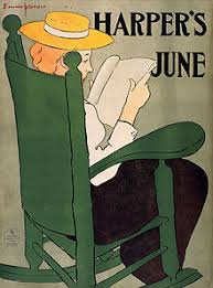
Cover art is more than just a pretty picture; it is an artistic expression that complements and enhances the music it represents. It sets the tone for what lies inside, providing a glimpse into the artist’s vision and capturing their essence. From iconic album covers like The Beatles’ “Abbey Road” or Pink Floyd’s “The Dark Side of the Moon,” to modern masterpieces like Beyoncé’s “Lemonade” or Kendrick Lamar’s “To Pimp a Butterfly,” cover art has become an essential component of an album’s identity.
In today’s digital age, where streaming platforms dominate how we consume music, one might argue that cover art has lost some of its significance. However, this couldn’t be further from the truth. In fact, in a sea of endless song choices, cover art serves as a visual anchor that helps us navigate through vast musical landscapes. It catches our attention and entices us to explore further.
Cover art has evolved with technology and artistic trends over time. From hand-drawn illustrations to bold graphic designs and striking photography, artists have used various mediums to create visually stunning album covers. The interplay between visual elements and musical themes allows for endless creativity and possibilities.
Beyond its aesthetic appeal, cover art also acts as a form of storytelling. It can convey messages or narratives that complement or contrast with the music itself. It can provide social commentary or reflect cultural movements. Think about Nirvana’s iconic “Nevermind” cover featuring a baby swimming underwater, which became a symbol of the grunge era and rebellion against mainstream culture.
Moreover, cover art has the power to become ingrained in popular culture. It can become instantly recognizable and synonymous with an artist or a specific time period. The Rolling Stones’ “Sticky Fingers” with its provocative zipper cover or Nirvana’s “Smells Like Teen Spirit” with its rebellious teenage spirit captured the essence of their respective eras and remain iconic to this day.
In an age where music is increasingly consumed through digital platforms, some argue that cover art is losing its impact. However, it is important to note that digital formats have also given rise to new possibilities for cover art. Artists can now experiment with interactive designs, animated visuals, and even virtual reality experiences that further immerse listeners in their musical universe.
Cover art continues to be a vital part of the music industry, serving as a visual representation of an artist’s creativity and identity. It sparks conversations, generates anticipation for new releases, and leaves a lasting imprint on our memories. So next time you listen to your favorite album, take a moment to appreciate the captivating cover art that helped shape your musical journey.
Simplify and Avoid Clutter
Convey the Main Message with Concise Text
Choose Genre-Appropriate Colors that Stand Out
4. Evoke Emotion with Relevant
- Keep it simple and avoid clutter.
- Use short, concise text to convey the main message of your cover art.
- Use colors that are appropriate for the genre or topic of your work and that will stand out on a digital shelf.
- Consider using visuals that evoke emotion in viewers and relate to the content of your work.
- Make sure all text is legible at a small size, as this is how most people will view it online or in print media.
- Choose fonts that are easy to read, but also reflect the tone of your work and its genre or topic if possible.
- Incorporate symbols or images related to the content of your work into the design if possible (e.g., a book for a novel).
- Make sure all elements are properly aligned, with ample white space between them for balance and clarity when viewed at small sizes online or in print media
- Proofread all text before finalizing any designs, as typos can be easily overlooked when viewing artwork from afar
Keep it simple and avoid clutter.
Cover Art Tip: Keep it Simple and Avoid Clutter
When it comes to creating compelling cover art, one valuable tip to remember is to keep it simple and avoid clutter. In a world filled with visual stimuli, simplicity can often be the key to capturing attention and making a lasting impression.
A cluttered cover can overwhelm the viewer and make it difficult for them to focus on the essence of the artwork. By streamlining your design and eliminating unnecessary elements, you allow the main message or concept to shine through.
Simplicity doesn’t mean blandness or lack of creativity; rather, it involves thoughtful composition and strategic use of visual elements. Consider using clean lines, bold typography, and a limited color palette that enhances the overall aesthetic appeal.
By reducing visual noise, you create space for the viewer’s imagination to fill in the gaps. This can evoke curiosity and intrigue, enticing them to explore further. Remember that sometimes less is more – a minimalist approach can have a powerful impact.
Additionally, keeping your cover art simple allows for better readability, especially when displayed in smaller formats or on digital platforms. It ensures that important information such as the artist’s name or album title remains clear and legible even at reduced sizes.
When designing your cover art, think about what truly represents the essence of your music. Focus on conveying the mood or theme effectively without overwhelming the viewer with unnecessary details. Consider how each element contributes to the overall message you want to convey.
Remember that simplicity doesn’t mean sacrificing creativity or artistic expression; rather, it allows your artwork to communicate its intended message more effectively. So next time you’re designing cover art, embrace simplicity as a powerful tool in capturing attention and leaving a lasting impact on your audience.
Use short, concise text to convey the main message of your cover art.
The Power of Concise Text in Cover Art
When it comes to creating impactful cover art, sometimes less is more. One powerful tip to consider is using short and concise text to convey the main message of your cover art. By distilling your message into a few carefully chosen words, you can capture attention and leave a lasting impression on your audience.
In our fast-paced world, where attention spans are shrinking, it’s essential to grab the viewer’s attention quickly. Long paragraphs or excessive text can overwhelm and distract from the visual impact of your cover art. By using concise text, you create a focal point that guides the viewer’s eyes and directs their focus towards the essence of your artwork.
Short phrases or even single words can be incredibly effective in conveying the mood, theme, or concept of your music. They act as a hook that piques curiosity and invites listeners to explore further. Think about iconic album covers like The Clash’s “London Calling” with its simple yet bold typography or Daft Punk’s “Random Access Memories” with its sleek lettering. In both cases, the brevity of the text adds to the overall impact and memorability of the cover art.
Concise text also allows for versatility across different formats and platforms. Whether it’s a small thumbnail on a streaming platform or a larger vinyl sleeve, using fewer words ensures legibility and impact at various sizes. It ensures that your message remains clear and easily recognizable regardless of how it is viewed.
Furthermore, by keeping your text concise, you allow room for interpretation and personal connection. Your audience can project their own emotions and experiences onto the artwork without being overly influenced by lengthy explanations. This open-endedness can create a sense of intrigue and make your cover art more relatable to a broader range of listeners.
Remember that when using text in cover art, font choice and design play crucial roles as well. Select fonts that align with the overall aesthetic and mood of your music. Experiment with different sizes, styles, and placements to find the perfect balance between visual impact and legibility.
So, whether you’re designing cover art for your own music or working with a graphic designer, consider the power of concise text. By distilling your message into a few carefully chosen words, you can create cover art that captivates, engages, and leaves a lasting impression on your audience.
Use colors that are appropriate for the genre or topic of your work and that will stand out on a digital shelf.
The Importance of Color in Cover Art: Standing Out on the Digital Shelf
When it comes to creating cover art, one crucial tip stands out among the rest: use colors that are appropriate for the genre or topic of your work and that will stand out on a digital shelf. The impact of color cannot be overstated, as it plays a significant role in catching the attention of potential listeners or viewers.
Choosing the right colors for your cover art is essential for several reasons. Firstly, colors have the power to evoke emotions and set the mood. Different genres and topics elicit distinct feelings, and using colors that align with these emotions can help create a connection between the viewer and your work. For example, warm and vibrant colors like reds, oranges, and yellows often evoke energy and excitement, making them suitable for genres like pop or dance music. On the other hand, cool tones such as blues or greens can convey calmness or introspection, making them suitable for genres like jazz or acoustic music.
Secondly, selecting colors that stand out on a digital shelf is vital in today’s digital landscape. With countless options available at our fingertips on streaming platforms or online stores, it’s crucial to make your cover art visually appealing and eye-catching. Using contrasting colors can help your artwork pop amidst a sea of thumbnails and instantly grab the attention of potential listeners or viewers.
Consider the context in which your cover art will be viewed. Will it be displayed as a small thumbnail on a streaming platform? If so, bold and contrasting colors are more likely to stand out in this limited space. However, if your artwork will primarily be viewed on larger screens or physical formats like vinyl records or CDs, you may have more flexibility to experiment with different color schemes.
Furthermore, it’s important to keep in mind that different cultures associate different meanings with colors. While certain colors may be well-received in one culture or genre context, they may carry different connotations in another. Researching the cultural significance of colors can help you make informed decisions and ensure that your cover art resonates with your target audience.
In conclusion, when creating cover art, remember that colors are not just visually appealing but also have the power to evoke emotions and set the tone for your work. By using colors appropriate for the genre or topic of your piece and ensuring they stand out on a digital shelf, you can maximize the impact of your cover art and attract the attention it deserves. So, don’t underestimate the power of color – let it be your ally in creating captivating and enticing cover art that leaves a lasting impression.
Consider using visuals that evoke emotion in viewers and relate to the content of your work.
When it comes to creating cover art, one important tip to keep in mind is to consider using visuals that evoke emotion in viewers and relate to the content of your work. The power of visual storytelling can have a profound impact on how people connect with your music.
By choosing visuals that evoke emotion, you have the ability to create an immediate and visceral response from your audience. Whether it’s through vibrant colors, expressive imagery, or thought-provoking symbolism, you can capture the essence of your music and convey its emotional depth.
Think about the themes and messages within your music. What emotions do they evoke? Is it joy, sadness, nostalgia, or something entirely different? By selecting visuals that align with these emotions, you create a cohesive experience for your listeners.
Additionally, it’s essential to ensure that the visuals you choose relate directly to the content of your work. The cover art should serve as a visual representation of what listeners can expect from your music. It sets the tone and prepares them for the journey they are about to embark on.
For example, if your album explores themes of nature and tranquility, consider using imagery of serene landscapes or elements of the natural world. If your music delves into introspection and personal growth, perhaps opt for symbolic visuals that reflect self-discovery and transformation.
Remember that cover art is not just a decorative element; it is an opportunity to communicate with your audience on a deeper level. When viewers connect emotionally with your cover art, they are more likely to be drawn in and compelled to explore further.
In conclusion, when creating cover art for your music, take the time to carefully select visuals that evoke emotion in viewers and relate directly to the content of your work. By doing so, you can establish a strong connection with your audience before they even press play.
Make sure all text is legible at a small size, as this is how most people will view it online or in print media.
The Importance of Legible Text in Cover Art
When it comes to creating cover art, there are many factors to consider. One crucial aspect that often gets overlooked is the legibility of the text. Whether your cover art will be viewed online or in print media, it is essential to ensure that all text remains clear and readable, even at a small size.
In today’s digital age, where album covers are often displayed as thumbnail images on streaming platforms or social media feeds, it’s important to remember that most people will see your cover art in a reduced size. If the text on your artwork becomes blurry or illegible when scaled down, it can hinder the overall impact and message you intended to convey.
Legible text is equally important for print media such as CD covers or vinyl sleeves. Even though physical formats might offer more space for larger designs, there will still be instances where your cover art needs to be resized or reproduced in smaller formats. Ensuring legibility ensures that your artwork retains its visual appeal and effectively communicates with viewers.
To achieve legible text in cover art, consider the following tips:
- Font Choice: Select fonts that are clear and readable even at smaller sizes. Avoid overly decorative or intricate fonts that may lose their clarity when scaled down.
- Font Size and Weight: Opt for slightly larger font sizes than you would use for normal reading purposes. Additionally, choose font weights (such as bold) that enhance visibility without sacrificing style.
- Contrast: Ensure a sufficient contrast between the text and background colors. Use light-colored text on dark backgrounds or vice versa to enhance readability.
- Simplify Text: Keep your messaging concise and avoid overcrowding the design with excessive text. Focus on key information such as artist name, album title, and any additional essential details.
- Test at Different Sizes: Before finalizing your design, test how it appears at various sizes to ensure legibility remains intact. View it on different devices or print it out to see how it looks in physical form.
By prioritizing legible text in your cover art, you ensure that your artwork remains visually appealing and effectively communicates its intended message. Whether viewed online or in print media, clear and readable text will captivate viewers and leave a lasting impression. Remember, the small details matter, and legibility is key to creating impactful cover art.
Choose fonts that are easy to read, but also reflect the tone of your work and its genre or topic if possible.
Choosing the Right Fonts for Your Cover Art: Balancing Readability and Tone
When it comes to creating cover art, one crucial element that often gets overlooked is the choice of fonts. Fonts play a significant role in conveying the message and setting the tone for your work. It’s essential to strike a balance between readability and reflecting the genre or topic of your art.
First and foremost, readability should be a top priority. No matter how visually stunning your cover art may be, if the text is difficult to read, it can hinder the overall impact. Opt for fonts that are clear, legible, and easy on the eyes. Consider factors such as font size, spacing between letters, and overall clarity.
However, readability doesn’t mean you have to sacrifice creativity or style. Fonts can be an excellent tool for expressing the tone of your work or its genre. For example, if you’re designing cover art for a whimsical children’s book, playful and rounded fonts might be fitting. On the other hand, if you’re creating cover art for a thriller novel, bold and sharp-edged fonts can convey a sense of suspense.
It’s important to consider how different fonts evoke specific emotions or associations. Serif fonts like Times New Roman or Garamond often give a classic and elegant feel suitable for historical fiction or literary works. Sans-serif fonts like Helvetica or Arial provide a clean and modern look that works well with contemporary genres such as science fiction or self-help books.
Additionally, consider any unique characteristics of your work’s genre or topic that could be reflected in the font choice. If you’re designing cover art for a horror novel set in Victorian England, selecting an ornate serif font might capture that historical Gothic atmosphere.
Remember that while it’s essential to choose fonts that align with your work’s tone and genre, readability should remain paramount. Avoid overly decorative or intricate fonts that may sacrifice clarity in favor of style.
Lastly, don’t be afraid to experiment and explore different font combinations. Pairing fonts that complement each other can add visual interest and create a harmonious balance. Just ensure that the combination you choose maintains readability and doesn’t overwhelm or distract from the overall design.
In conclusion, selecting fonts for your cover art requires careful consideration of both readability and the tone of your work. Strive for a balance that allows your text to be easily read while also reflecting the genre or topic of your art. By making thoughtful font choices, you can enhance the impact of your cover art and create a visually compelling representation of your work.
Incorporate symbols or images related to the content of your work into the design if possible (e.g., a book for a novel).
Incorporating Symbols and Images: Enhancing the Meaning of Cover Art
When it comes to creating cover art, one powerful tip to consider is incorporating symbols or images that are directly related to the content of your work. Whether you’re designing a book cover for a novel, an album cover for a music project, or any other form of artistic expression, this approach can significantly enhance the overall impact and meaning of your design.
Symbols have a unique ability to convey complex ideas and emotions in a concise and visually compelling manner. By carefully selecting symbols or images that represent key themes, motifs, or characters from your work, you can create a deeper connection between the visual representation and the content itself.
For instance, if you’re designing a book cover for a novel set in an enchanted forest, incorporating elements such as trees, mystical creatures, or magical artifacts can instantly transport readers into the world you’ve created. These symbols not only capture their attention but also serve as visual cues that hint at the story’s genre and atmosphere.
Similarly, in music cover art, incorporating symbols or images related to the album’s themes or lyrics can provide listeners with additional layers of interpretation. It allows them to engage with the music on multiple levels – both auditory and visual. For example, if your album explores themes of self-discovery and growth, including imagery like blossoming flowers or soaring birds can evoke feelings of transformation and liberation.
By incorporating relevant symbols or images into your cover art design, you create an opportunity for deeper engagement with your audience. It invites them to explore further and uncover connections between the visuals they see and the content they experience.
However, it’s important to strike a balance between being explicit enough for viewers to understand the symbolism while still leaving room for their interpretation. The goal is not to create a literal representation but rather to spark curiosity and intrigue.
When executed effectively, incorporating symbols or images related to your work can make your cover art more memorable, impactful, and meaningful. It becomes a visual representation that resonates with your audience even before they dive into the content itself.
So, whether you’re an author, musician, or any other creative individual working on cover art, consider harnessing the power of symbols and images. Let them serve as gateways to the world you’ve crafted, leaving a lasting impression on those who encounter your work.
Make sure all elements are properly aligned, with ample white space between them for balance and clarity when viewed at small sizes online or in print media
The Importance of Proper Alignment and White Space in Cover Art
When it comes to creating captivating cover art, attention to detail is crucial. One essential tip that should not be overlooked is ensuring that all elements are properly aligned and have ample white space between them. This practice not only enhances the overall aesthetic appeal but also ensures clarity and balance when viewed at small sizes, whether online or in print media.
Proper alignment is key to creating a visually pleasing composition. When elements are aligned correctly, they create a sense of order and harmony. Whether it’s text, images, or graphic elements, making sure they are aligned along a common axis or grid helps create a cohesive and professional look. It prevents visual clutter and confusion, allowing the viewer’s eyes to navigate smoothly across the artwork.
White space, also known as negative space, refers to the empty areas surrounding the elements in your cover art. It plays a vital role in achieving balance and clarity. Ample white space gives your design room to breathe, allowing each element to stand out on its own while maintaining an overall sense of unity. It provides visual rest for the viewer’s eyes and helps draw attention to the focal points of your artwork.
When designing cover art for both online platforms and print media, it’s important to consider how it will appear at smaller sizes. In today’s digital age, where album covers may be viewed as tiny thumbnails on streaming platforms or social media feeds, maintaining clarity becomes even more crucial. By ensuring proper alignment and utilizing white space effectively, you can ensure that your cover art remains visually appealing and legible even at smaller sizes.
Furthermore, when printed on physical media such as CDs or vinyl records, cover art with proper alignment and ample white space retains its impact. It allows for better readability of text and prevents any visual overcrowding when scaled down for printing purposes.
In summary, paying attention to proper alignment and incorporating ample white space in your cover art is essential for achieving balance, clarity, and visual appeal. It ensures that your artwork remains visually striking and legible, whether viewed online as small thumbnails or in print media. So, next time you’re designing cover art, remember to give careful thought to alignment and white space to create a captivating and well-balanced composition.
Proofread all text before finalizing any designs, as typos can be easily overlooked when viewing artwork from afar
The Importance of Proofreading in Cover Art Design
When it comes to creating captivating cover art, attention to detail is crucial. Every element, from the imagery to the typography, plays a significant role in conveying the intended message. However, one aspect that is often overlooked but holds immense importance is proofreading.
In the excitement of finalizing a design, it’s easy to overlook small errors or typos in the text. After all, when viewing artwork from afar or in its digital form, these mistakes may not be immediately noticeable. However, it’s essential to remember that cover art is meant to be seen by a wide audience, and any errors can detract from its impact and professionalism.
Proofreading serves as a vital step in ensuring that your cover art is polished and error-free. It involves carefully reviewing all text elements for grammar mistakes, spelling errors, punctuation issues, or inconsistencies. By taking the time to proofread thoroughly, you can avoid embarrassing and potentially costly mistakes.
Typos or grammatical errors on cover art can undermine the credibility of an artist or brand. They can create confusion for viewers and even diminish their interest in exploring further. Additionally, these mistakes may reflect poorly on the overall quality and attention to detail associated with the music itself.
To prevent such oversights, make proofreading an integral part of your design process. Here are a few tips to help you get started:
- Take breaks: After completing your design, step away from it for some time before proofreading. This break allows you to approach the text with fresh eyes and helps you spot errors more effectively.
- Use tools: Utilize spelling and grammar checking tools available in design software or use dedicated proofreading tools like Grammarly or Hemingway Editor for an extra layer of assurance.
- Read aloud: Reading your text aloud helps identify awkward phrasing or missing words that may have been overlooked during silent reading.
- Enlist a second set of eyes: Collaborate with a colleague, friend, or professional proofreader to review your design. Fresh perspectives can catch errors that you might have missed.
Remember, even the most visually stunning cover art can be marred by a simple typo. By incorporating thorough proofreading into your design process, you can ensure that your artwork is flawless and leaves a lasting impression on viewers.